Are your customers pushing your buttons…or are you pushing theirs?
Shouldn’t it be obvious? Just push the button that says “Add to Cart.”
YES! It should be obvious…
Here are 6 Quick Fixes for your buttons… each of which give you a conversion rate boost.
What’s even better: many of them are related, so sometimes a single change can fix multiple problems.
One Button to Rule them All
There’s one question your customers ask themselves on every page of your website: what do I do next?
Ideally every page should have ONE, and only one, primary Call to Action (CTA). Sure, you’re going to have additional links on most pages for navigation, but there should only be on Big Button per page.
To quote Steve Krug:
Don’t Make Me Think!
Make the next action on every page the most obvious thing on the page by using a button that stands out from everything else.
- Search
- Learn More
- Add to Cart
- Checkout
- etc.
Go through every page on your site and ask yourself the question:
What’s the next most important thing for them to do on this page?
That’s your CTA.
Where’s Waldo?
What’s wrong with this picture?
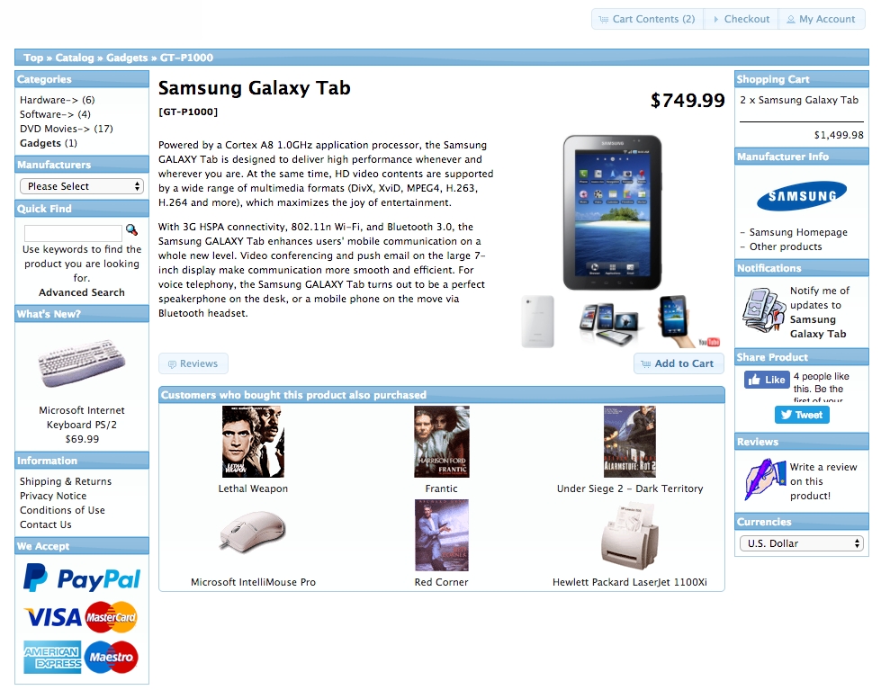
Example page from a well-known open source shopping cart demo.
Actually, more things than we could cover in one post, but let’s use it as an example for a few more answers…
First, of course, it really breaks the “One Call-to-Action” rule. Sure, there’s a case to be made for having some cross-sells and up-sells, but even with all that, where should we click?
If your goal is sales, you want them to click the Add to Cart button.
Wait… where is that?
Oh…. right… it’s that little blue button down there that blends in with everything else on the site.
Shouldn’t that be the most obvious thing on the page?
Size Matters
How do we make it stand out?
Here’s a simple one: bump up the size of the CTA button by 15%. While you’re at it, bold the button text.
Color Matters More
Even more important than size is color. Any well-designed site is going to have a “highlight” color in the palette.
Use your highlight color for all CTA buttons.
Always Be In The Right Place
Success = being in the right place at the right time… right?
Let’s think about how various people view a product page.
They obviously start at the top: title, photos, price, rating… hopefully a few well-written benefits.
If that’s all they need, we definitely want a button there… right? If they’re ready to buy, why make them scroll down through stuff they don’t need to read just to add it to their cart?
Lots of people want to read the entire description. Great. What comes right after that? You guessed it… another Add To Cart button.
Here’s the one nobody talk about….
More and more people rely on reviews when making purchase decisions (you DO have reviews, right?). Many of them will skip all of your (hopefully) well-written sales copy and just read what others are saying. Assuming the reviews hit home, they’re ready to buy. Why make them scroll all the way up to find the button?
Be sure to put another Add To Cart button right below your reviews!
And One for the Trash Can
OK, this one makes me crazy!
![]()
There are actually special plugins for some software that will let you add an “Empty Cart” button.
Wait… what!
Why would I want to even provide that option?
Seriously… dump it!
Advanced (Thinking): Avoid Your Graphic Artist
Yes… I know… everything should be all matchy-matchy on the site. I’ve been working with designers for 20 years.
I’m not saying they’re wrong. In 99% of the cases, the elements on your page need to be consistent with your color scheme.
But some of the most important buttons are the exception to the rule. Specifically Add to Cart and Checkout.
Do you want to know what the most tested piece of real estate is on the internet? The Add to Cart button at Amazon.com.
(one of our team members consults with Amazon on increasing their conversion rate)
So why wouldn’t we learn from the best?
I’ll spare you all of the color theory and details about gradients and borders and just give you the simple answer:
If you want a high-converting Add to Cart button, make it orange.